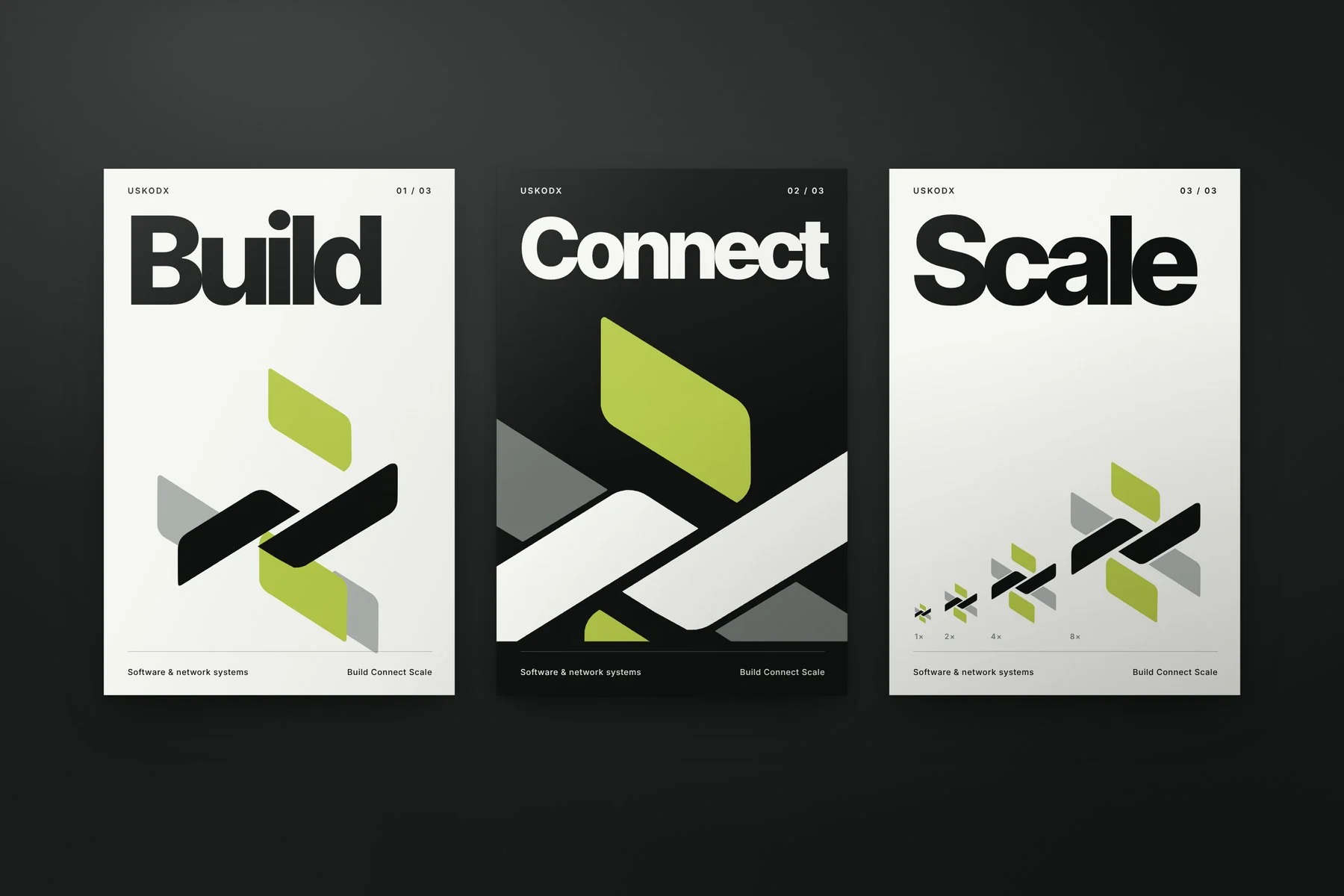
Create a clear identity for software and network systems. Express connection, structure and the ability to scale across digital communication.
02 / The solution
A weaver bird’s nest supplied the central idea: separate strands gain strength through connection. We translated that structure into an interlaced symbol and a precise visual language.
03 / Building the brand
The natural referenceIndividual fibres. One stronger structure
The structural ideaKeep the crossing. Simplify the strands
The symbolA clear, repeatable connection
04 / The brand system
The interlaced reference becomes a compact symbol that can repeat across every digital touchpoint. A dark foundation gives one controlled accent a clear job: draw attention to action.
TypographySöhne gives the name a direct, technical voice
05 / The brand in use
Poster series
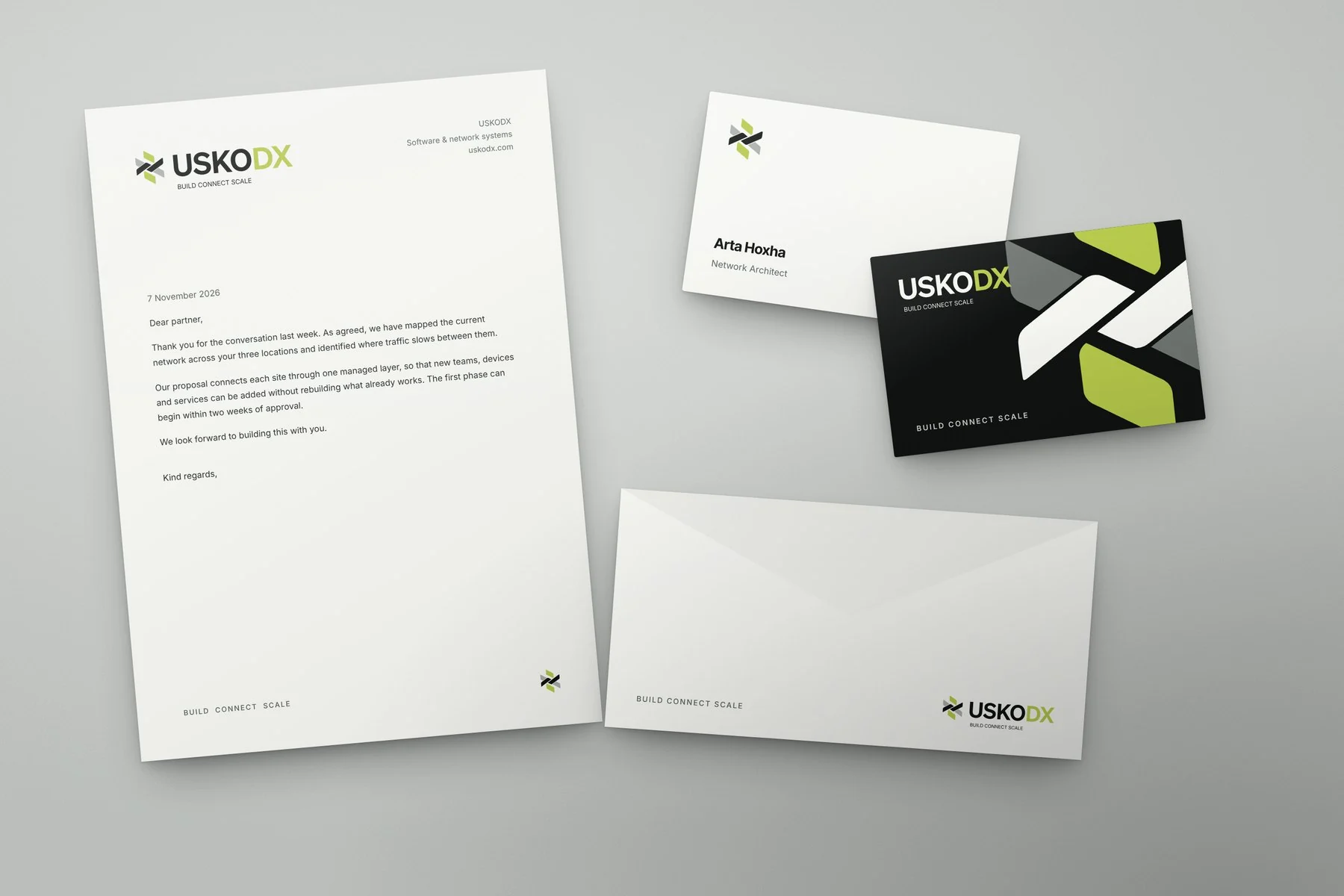
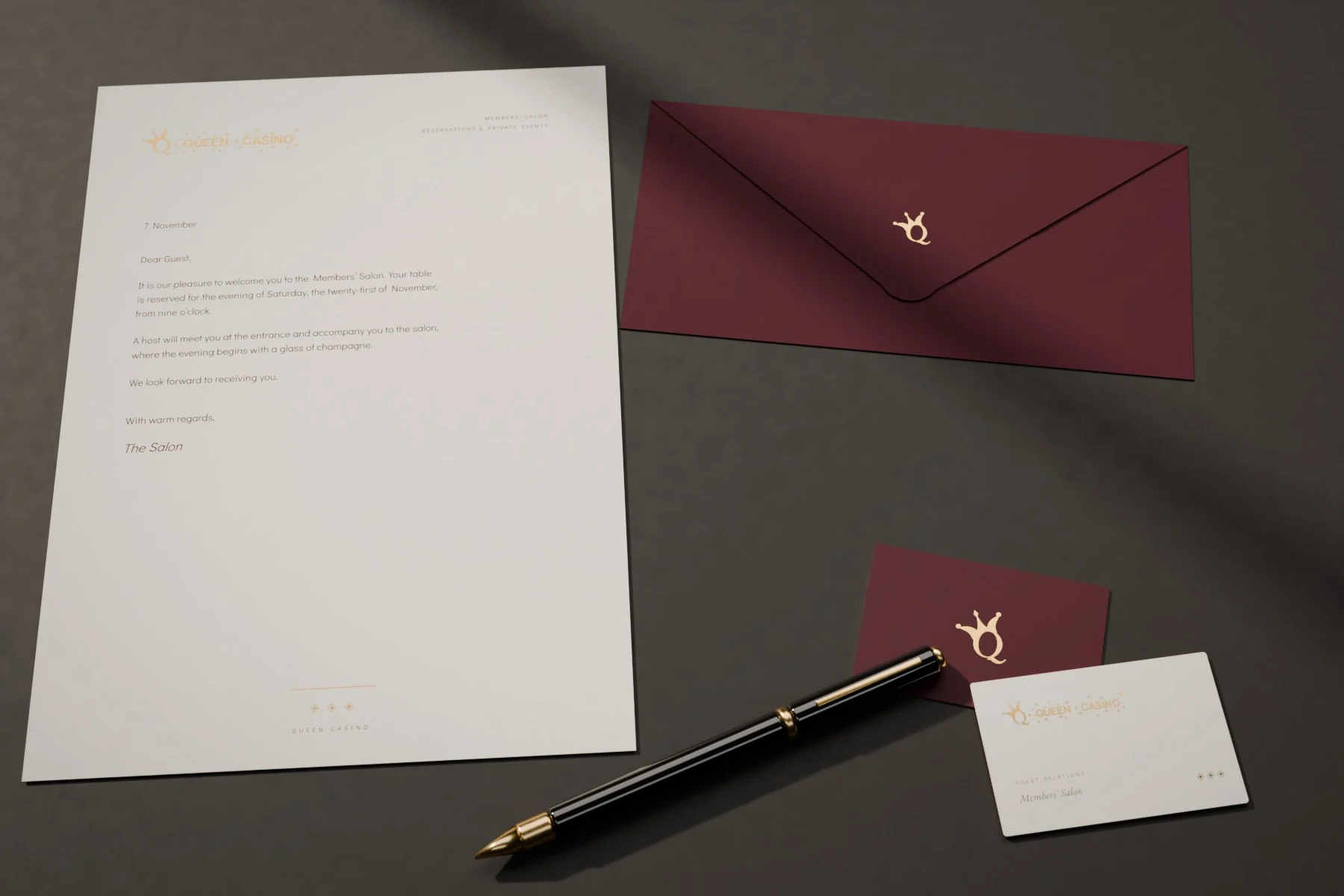
Stationery
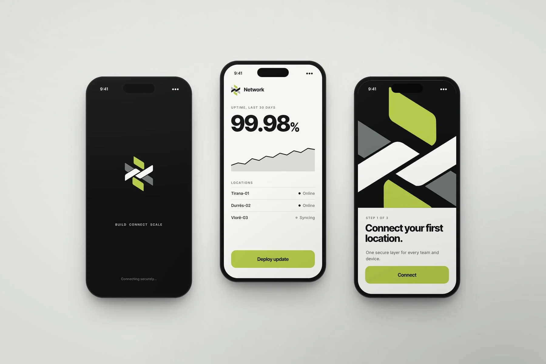
App
CreditsErjola Bllaca
Residential & luxury property
A small beginning. A lasting impression.
01 / The brief
Give a collection of luxury residences a distinctive, coherent presence. Convey the quality of the spaces through restraint, material and attention to detail.
02 / The solution
The name became the organising idea. A ripple begins at one point and travels outward. Wave and origin lead into a visual identity that connects logo, surfaces, spaces and communication.
03 / Building the brand
A point of originOne small point. Then an outward rhythm
Find the movementKeep the flow. Give it a direction
The resolved identityThe same movement, made recognisable
04 / The brand system
The idea moves beyond the logo. Parallel lines become flow, layered contours suggest material and relief, and a point with its rings expresses origin.
TypographyGeorgia introduces an editorial voice; clear supporting type keeps the experience calm
05 / The brand in use
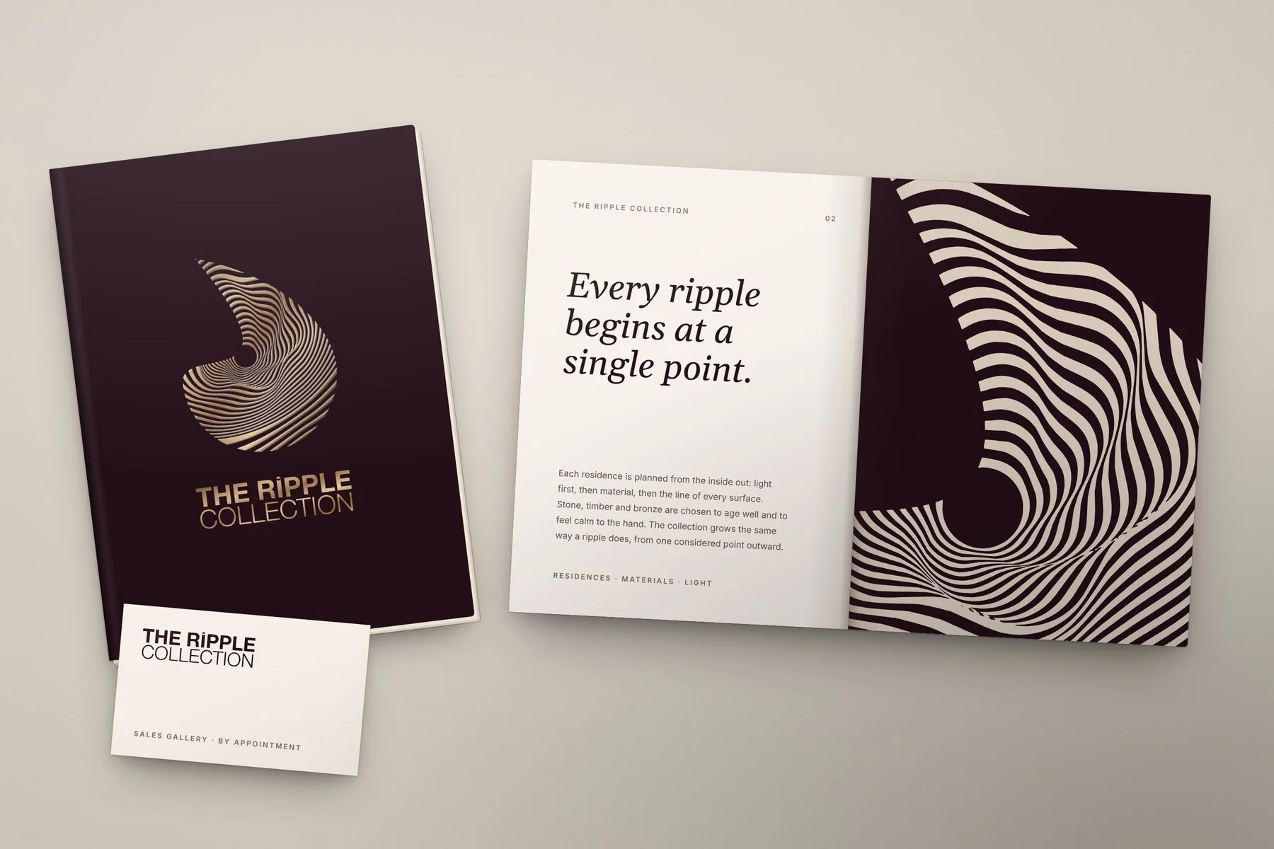
Brochure
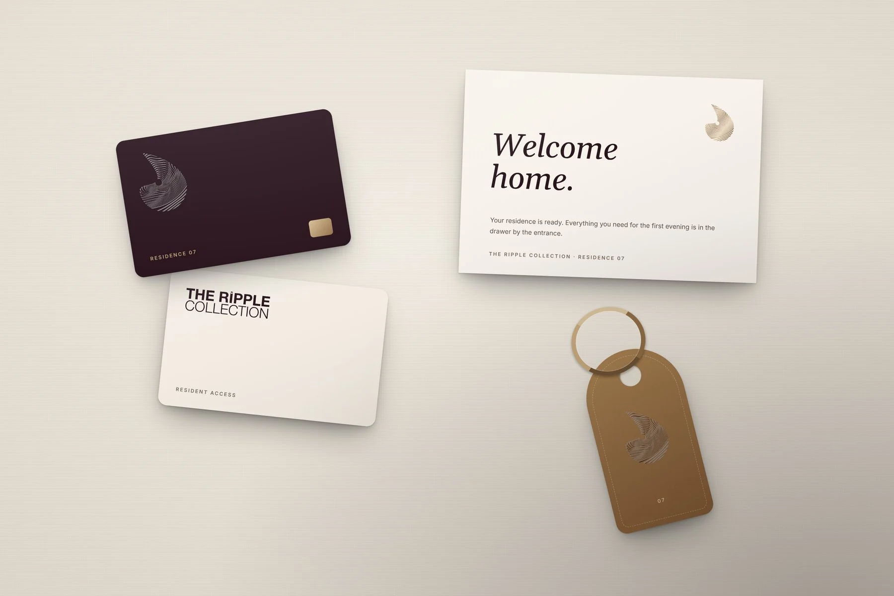
Welcome kit
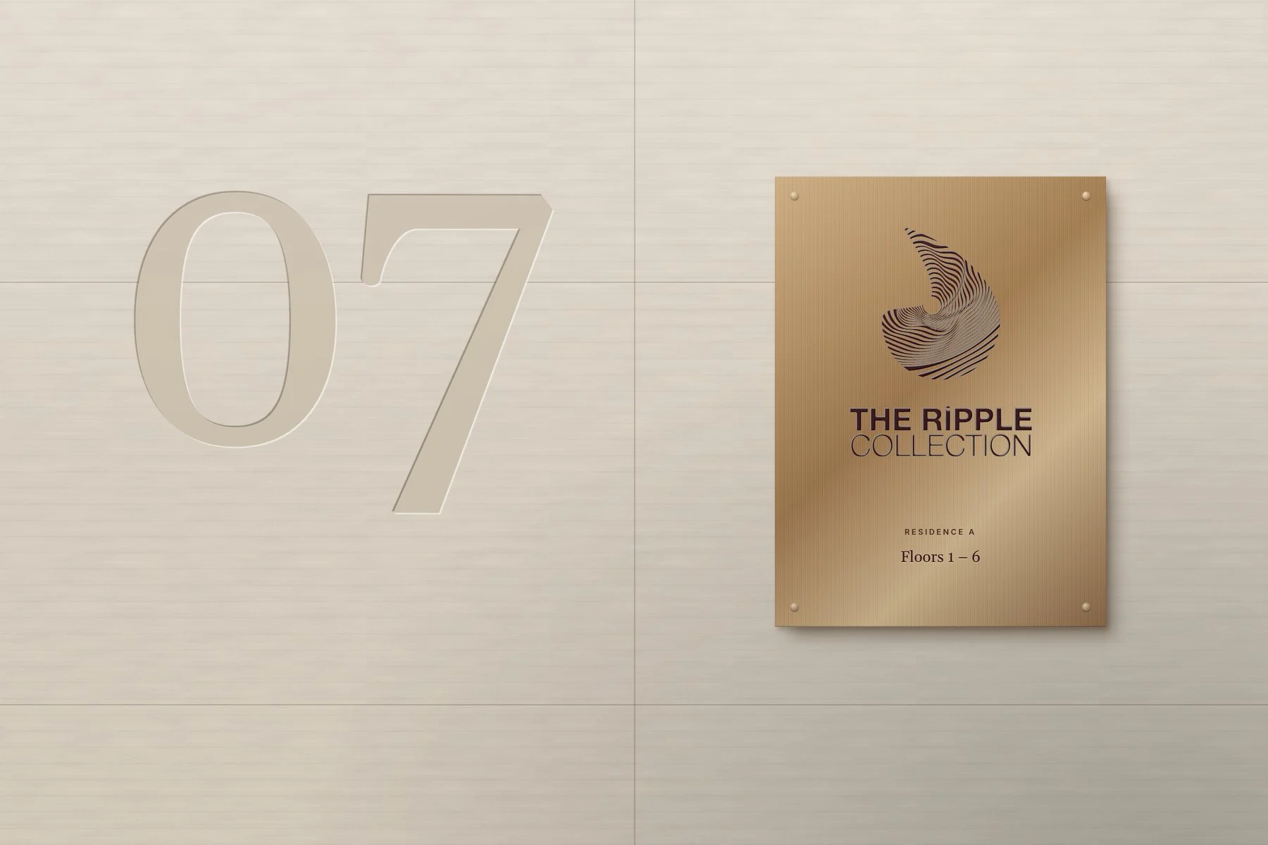
Signage
CreditsErjola Bllaca
THERA Medica Group · Healthcare
How can care feel precise and human?
01 / The brief
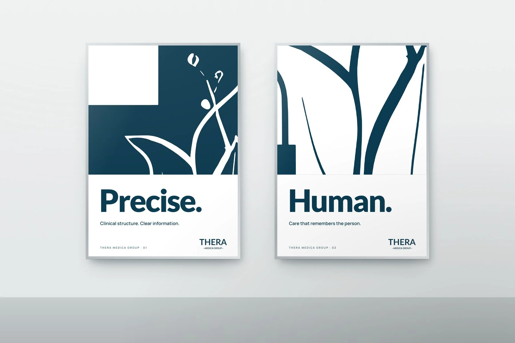
Build a professional healthcare identity grounded in trust, precision and clarity. Keep the human purpose of care visible within a consistent medical presence.
02 / The solution
We brought the medical cross and a tulip into one mark. Clinical structure meets therapeutic renewal, supported by calm blue, open space and direct typography.
03 / Building the brand
Structure + renewalThe cross gives structure. The tulip brings renewal
Bring them togetherLet the softer form live within the geometry
The resolved identityCare and precision, in one mark
04 / The brand system
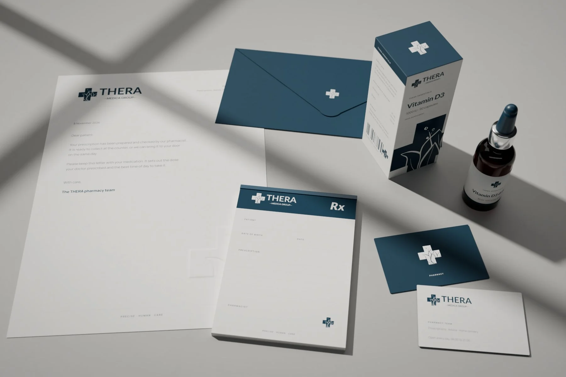
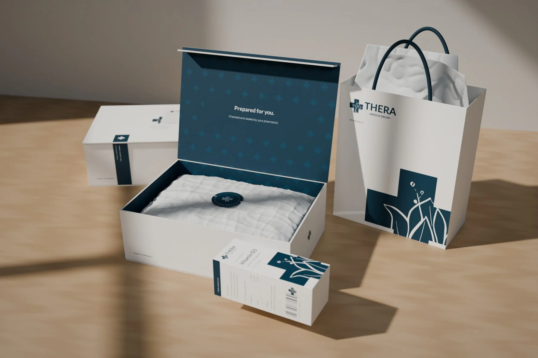
The cross gives the mark a clear healthcare context; the tulip’s fine lines soften the geometry. Deep medical blue sets a calm, professional tone, while white and gray create clarity around information.
TypographyLato Bold for THERA · Manrope for the supporting system
05 / The brand in use
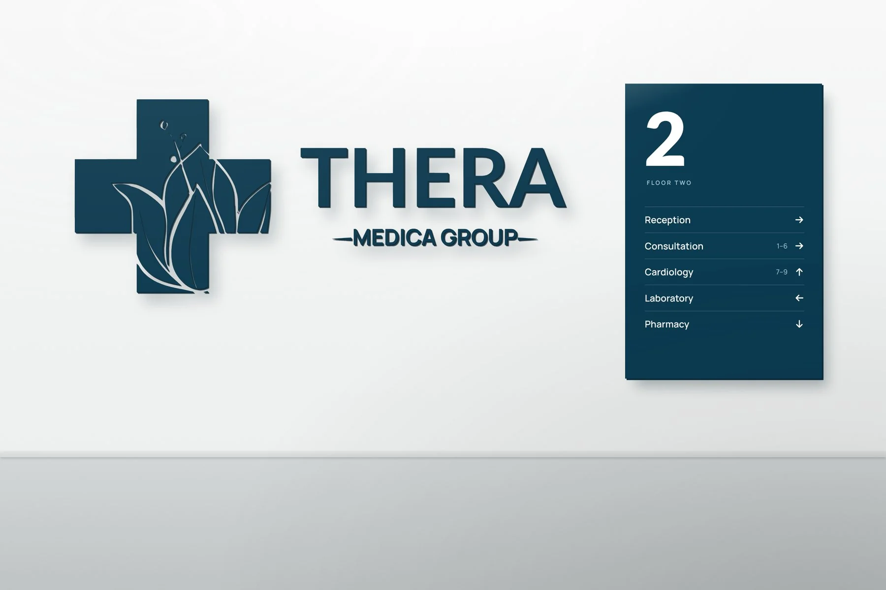
Wayfinding
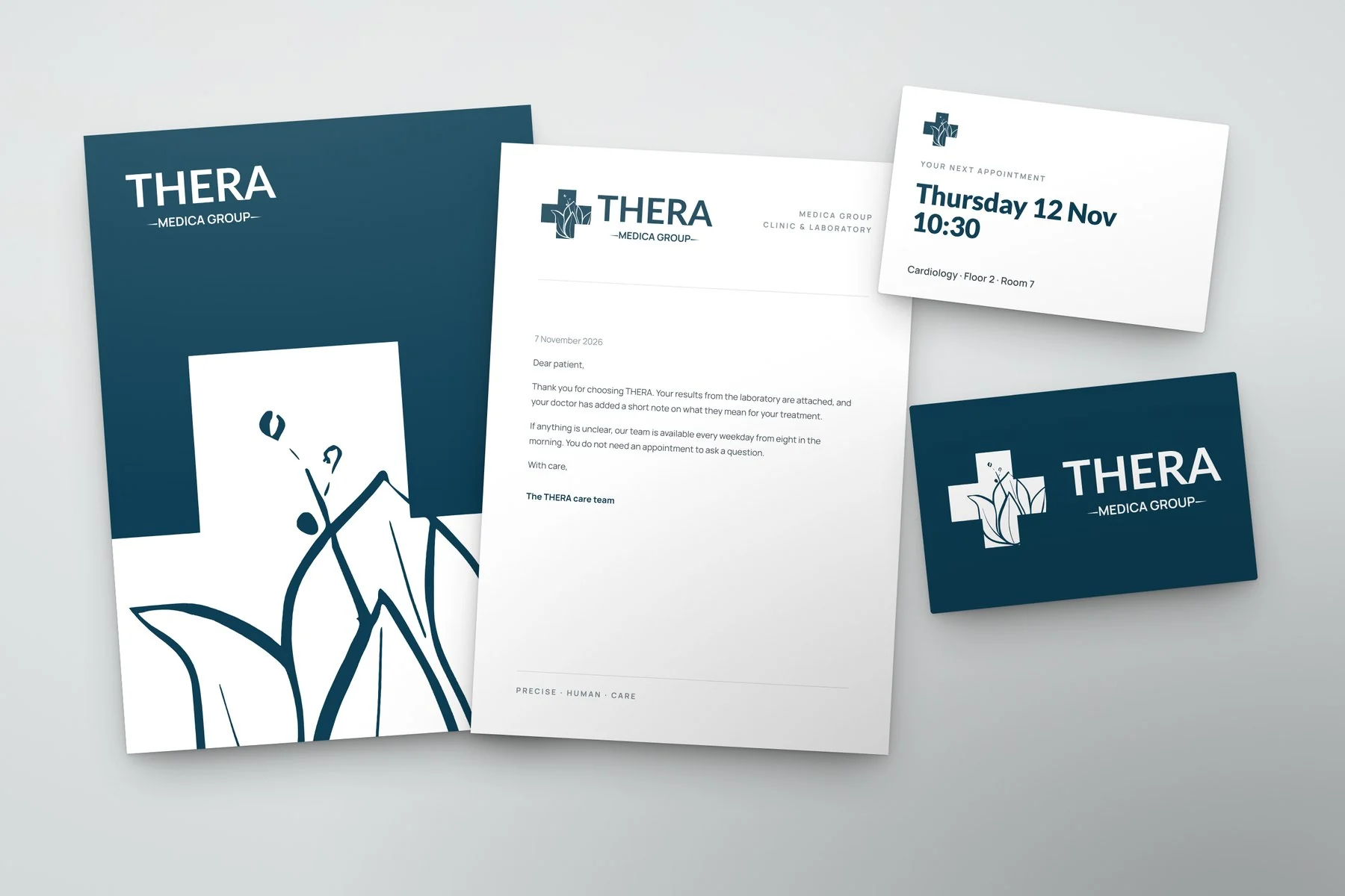
Print
Posters
Pharmacy stationery
Home delivery
CreditsErjola Bllaca
Entertainment
The name already contains the symbol.
01 / The brief
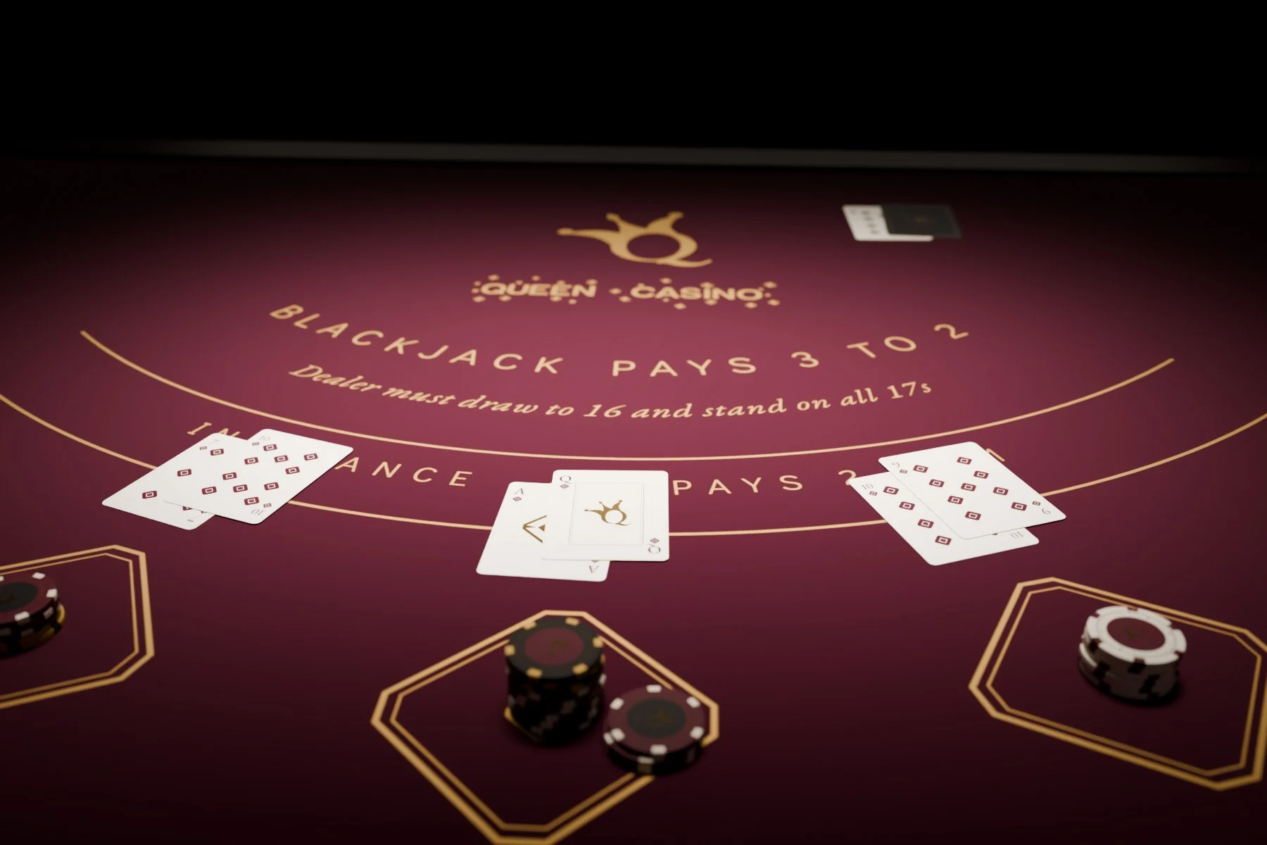
Give Queen Casino a recognisable identity with a strong sense of presence. Connect the name to a memorable symbol and a coherent visual atmosphere.
02 / The solution
The symbol brings together Q, a crown and a joker’s cap: the name, royalty and playful entertainment. Gold gives the horizontal signature a warm, distinctive presence.
03 / Building the brand
Three starting pointsThe initial. The crown. The joker’s playful cap
Fuse the three ideasThree references, drawn as one gesture
The resolved symbolRoyal presence. A playful character
04 / The brand system
The Q, crown and cap form one monogram, and small diamonds add rhythm beside the name. Gold leads; burgundy and obsidian create contrast, and ivory offers a warmer light background.
TypographyGaramond for the editorial voice · Century Gothic for information
A project can begin with a name, an identity, a shoot, a social media presence or a final image. I can contribute at one stage or connect the full visual journey.
01
Brand visual identity
Naming & brand concept
Logo & visual identity
Colour & typography
Guidelines & visual applications
02
Photography
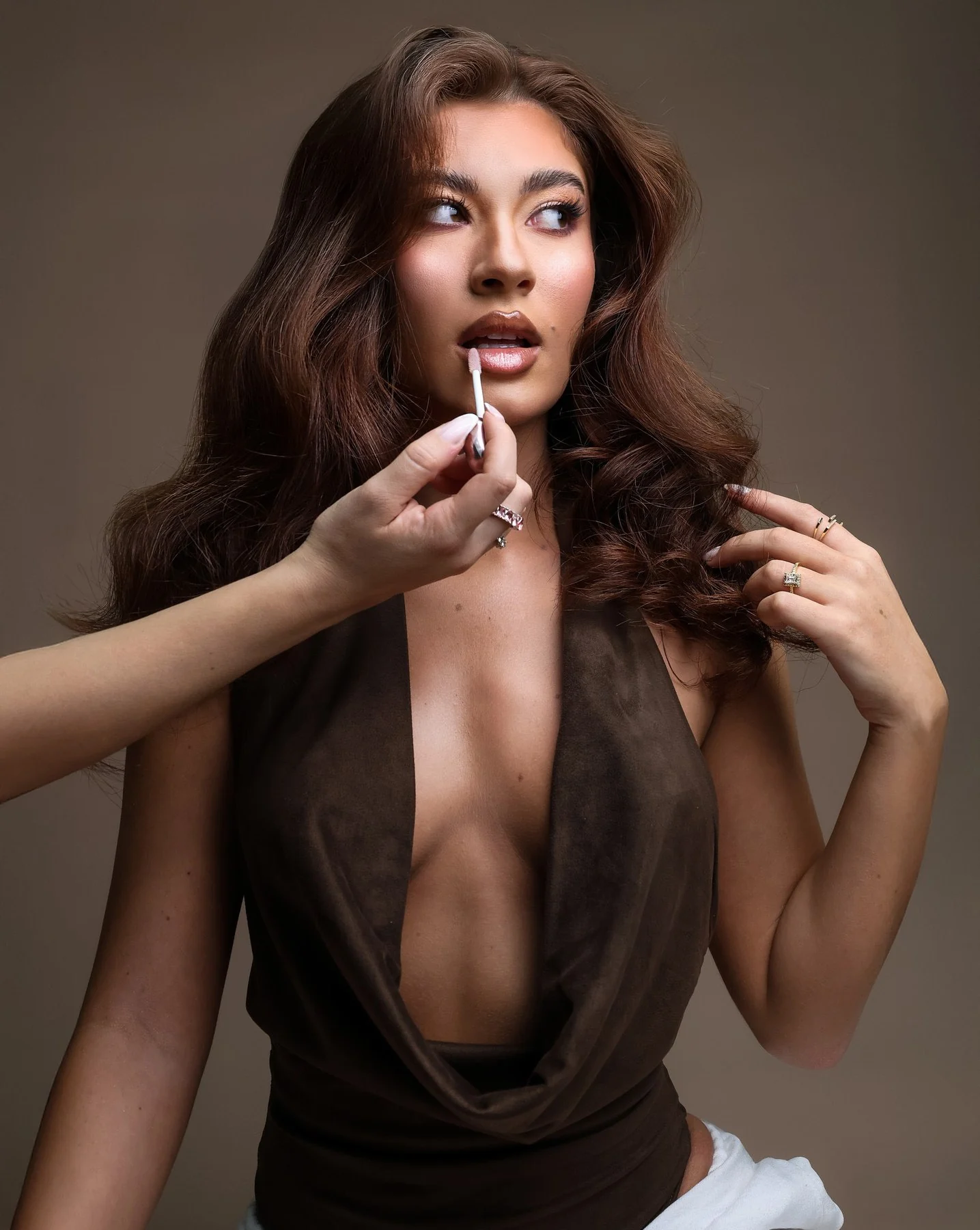
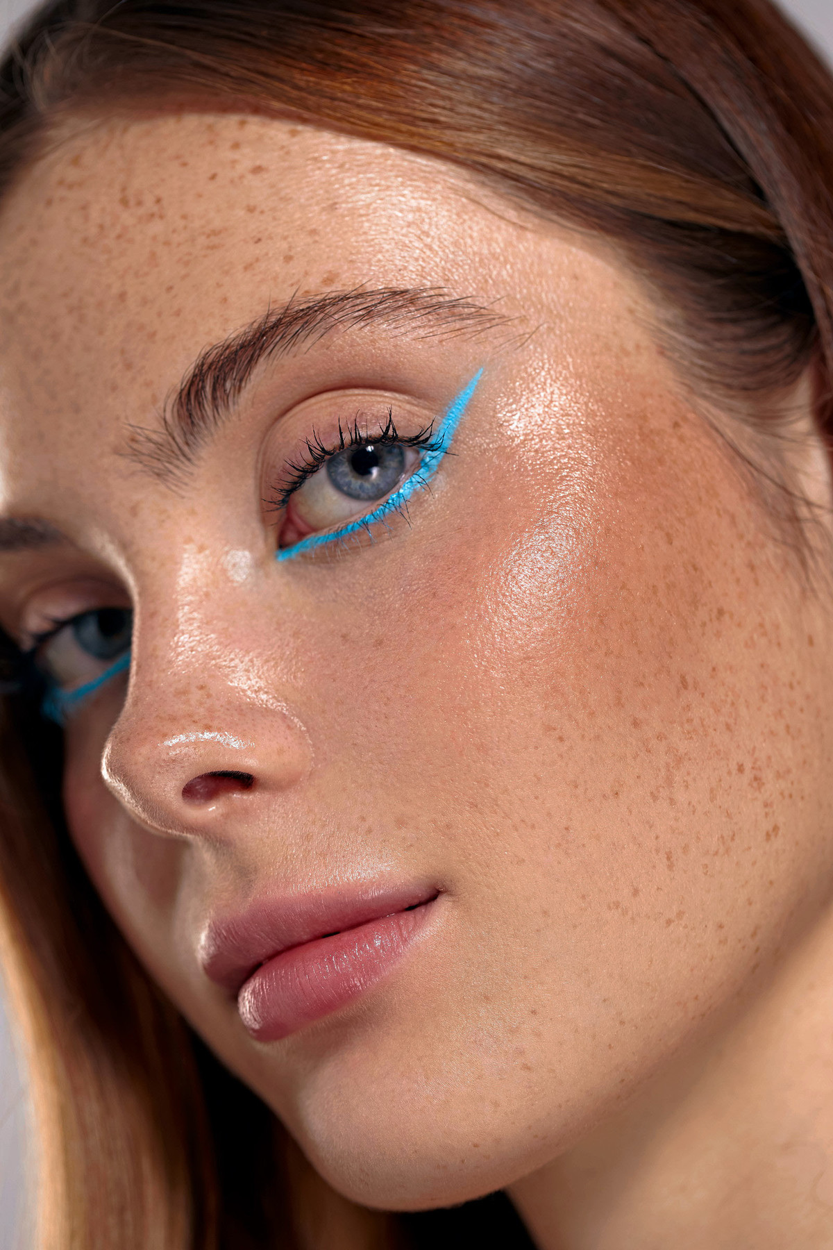
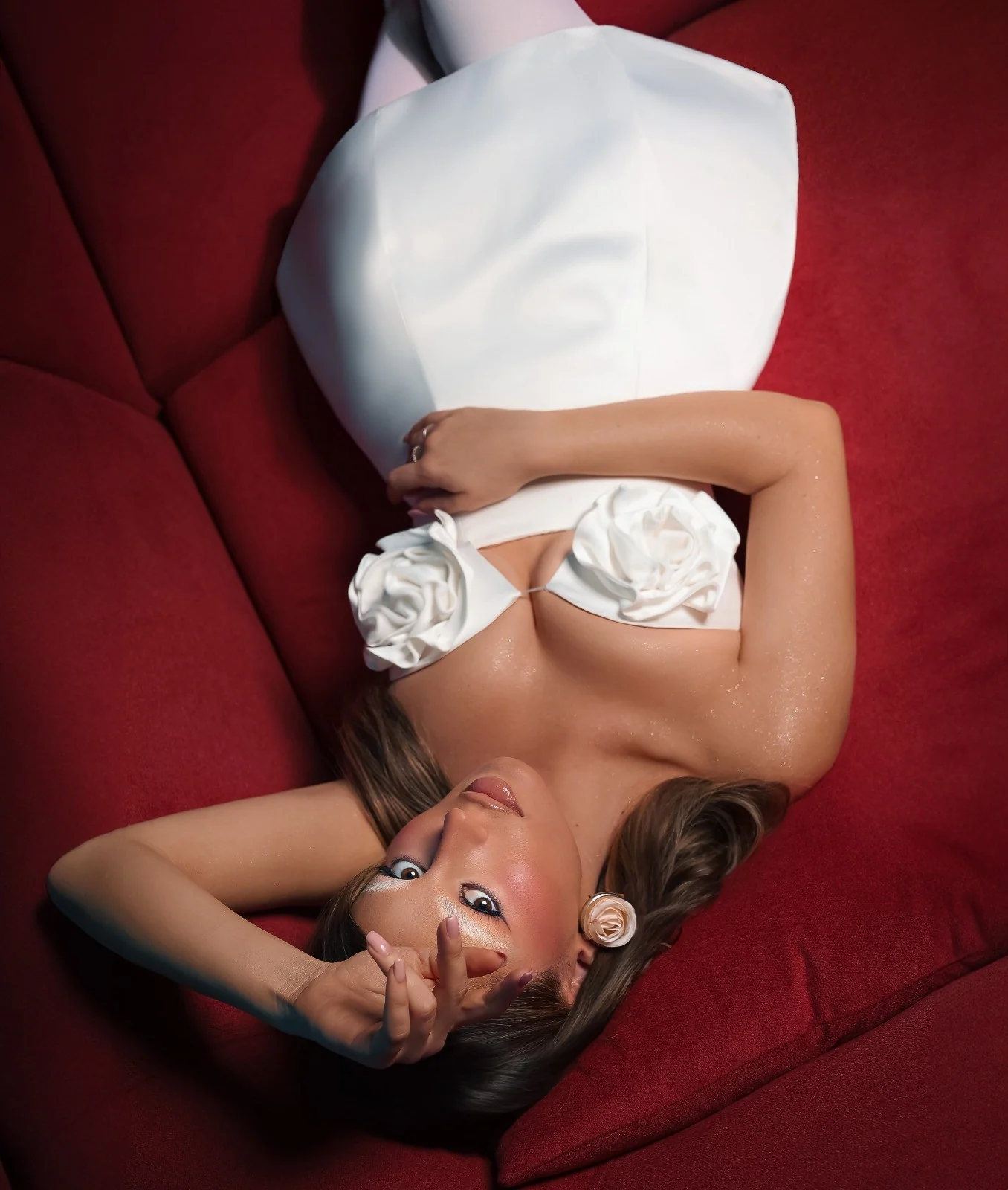
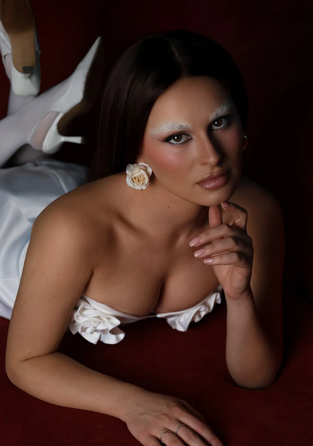
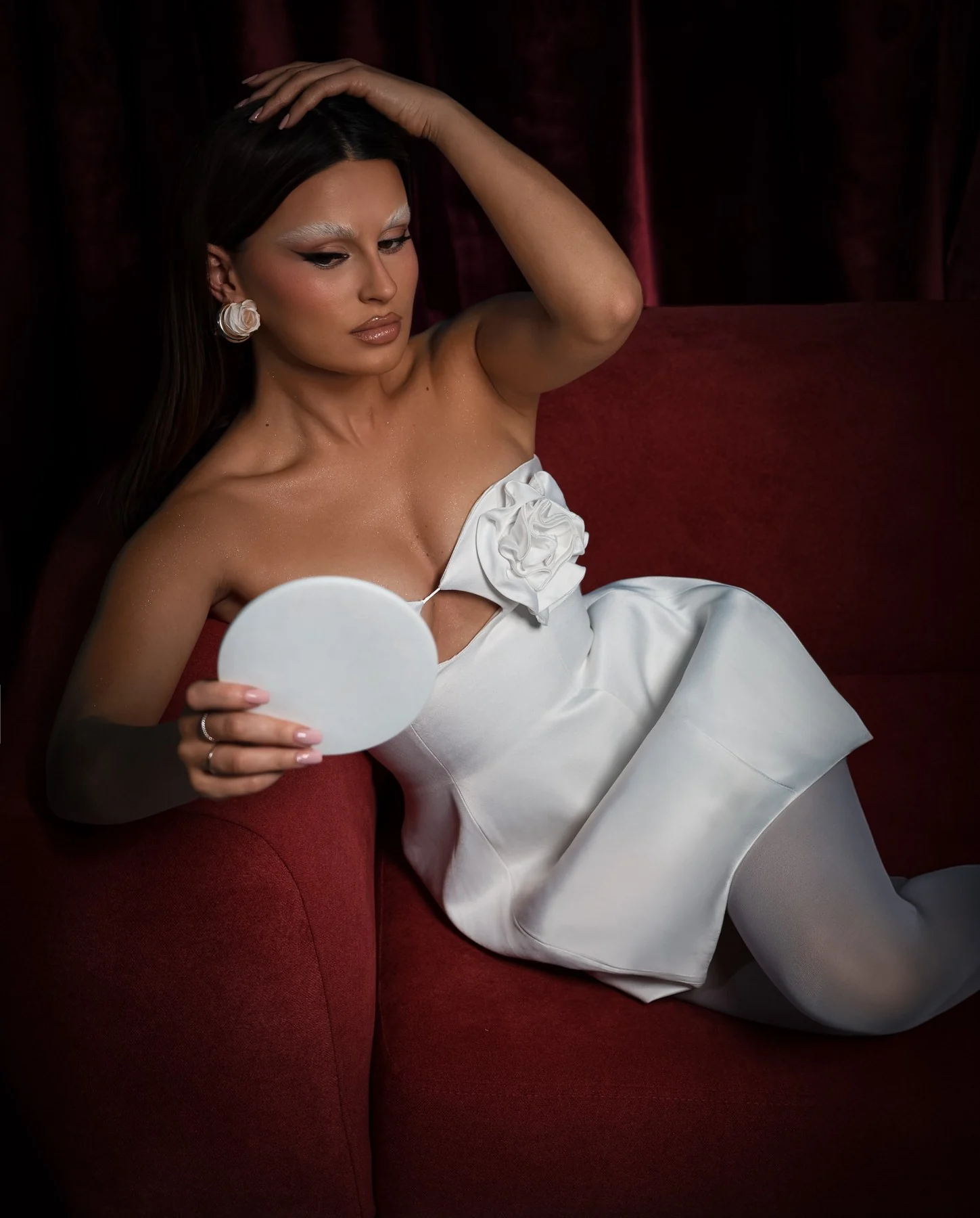
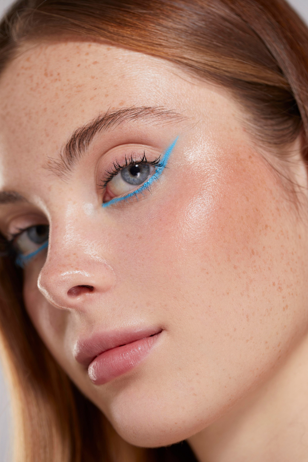
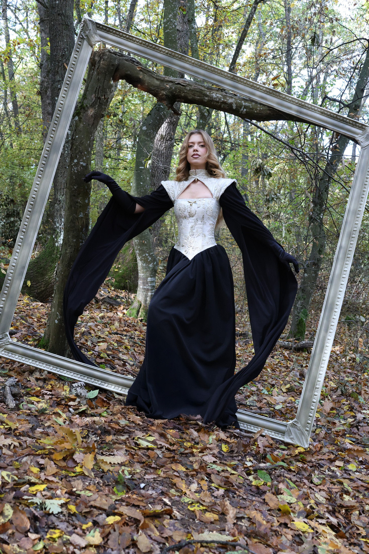
Fashion & beauty
Editorial portraits
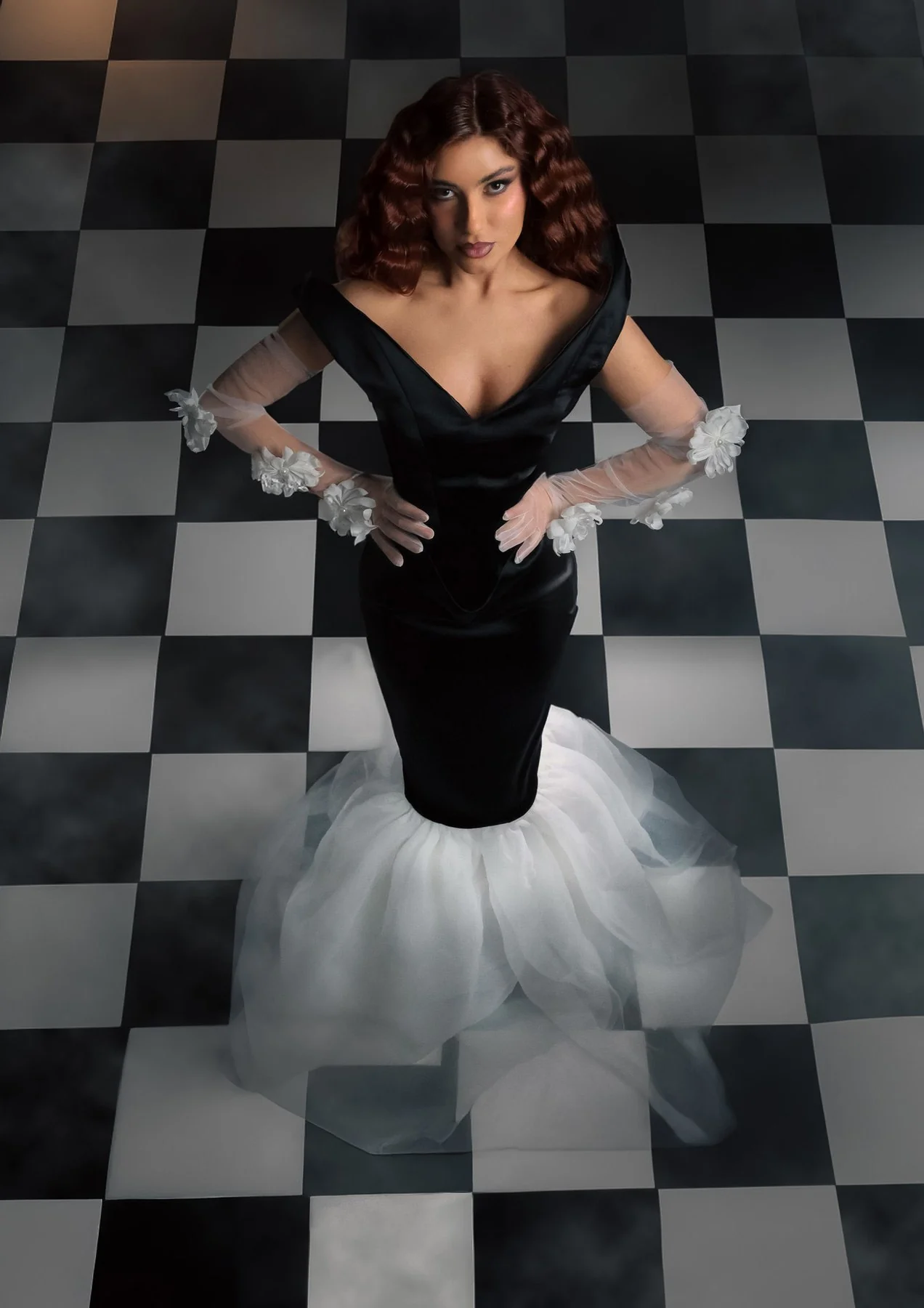
Concept development
Creative direction & photography
03
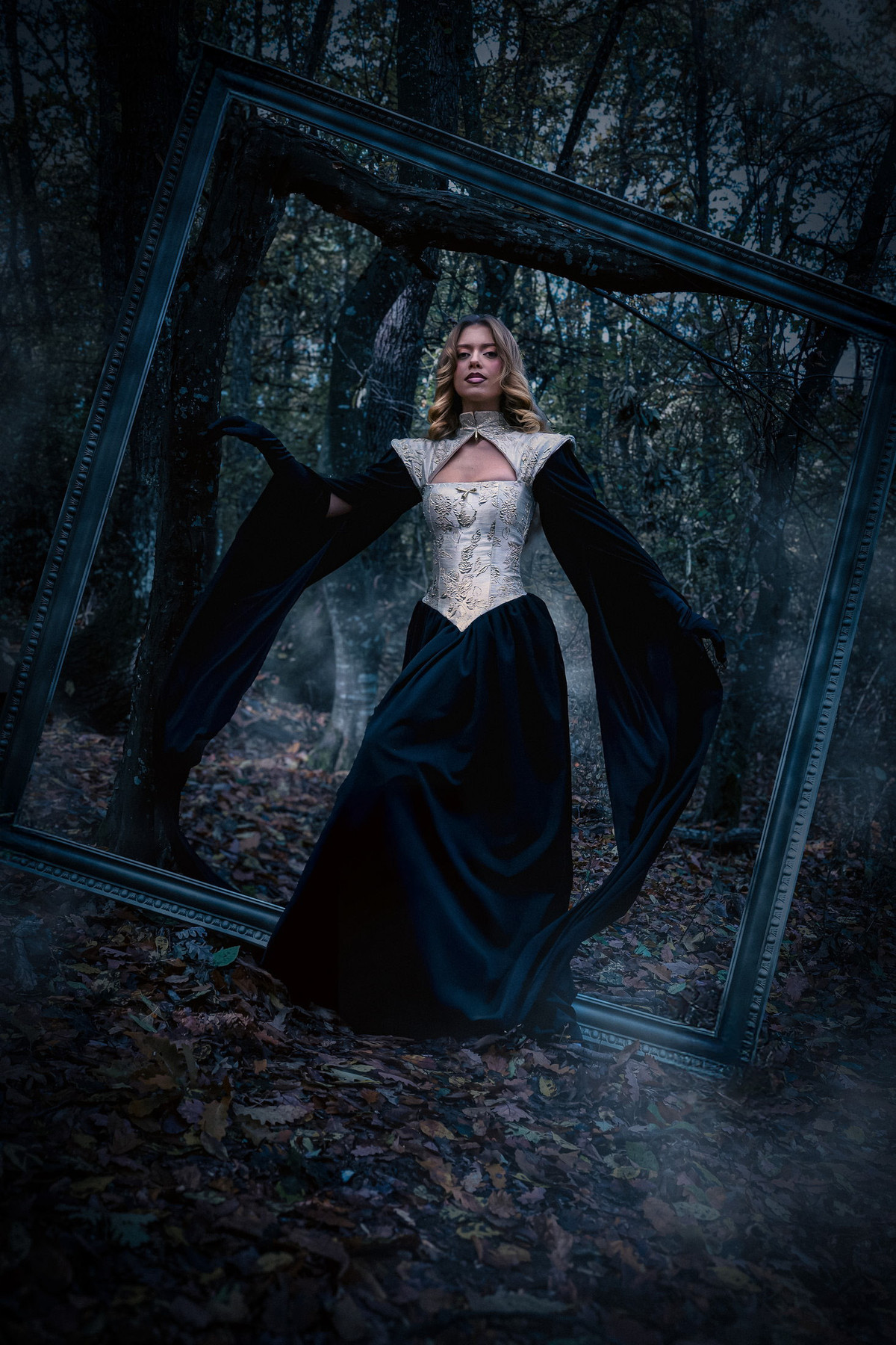
Retouching
Natural portrait & beauty finish
Colour & tonal control
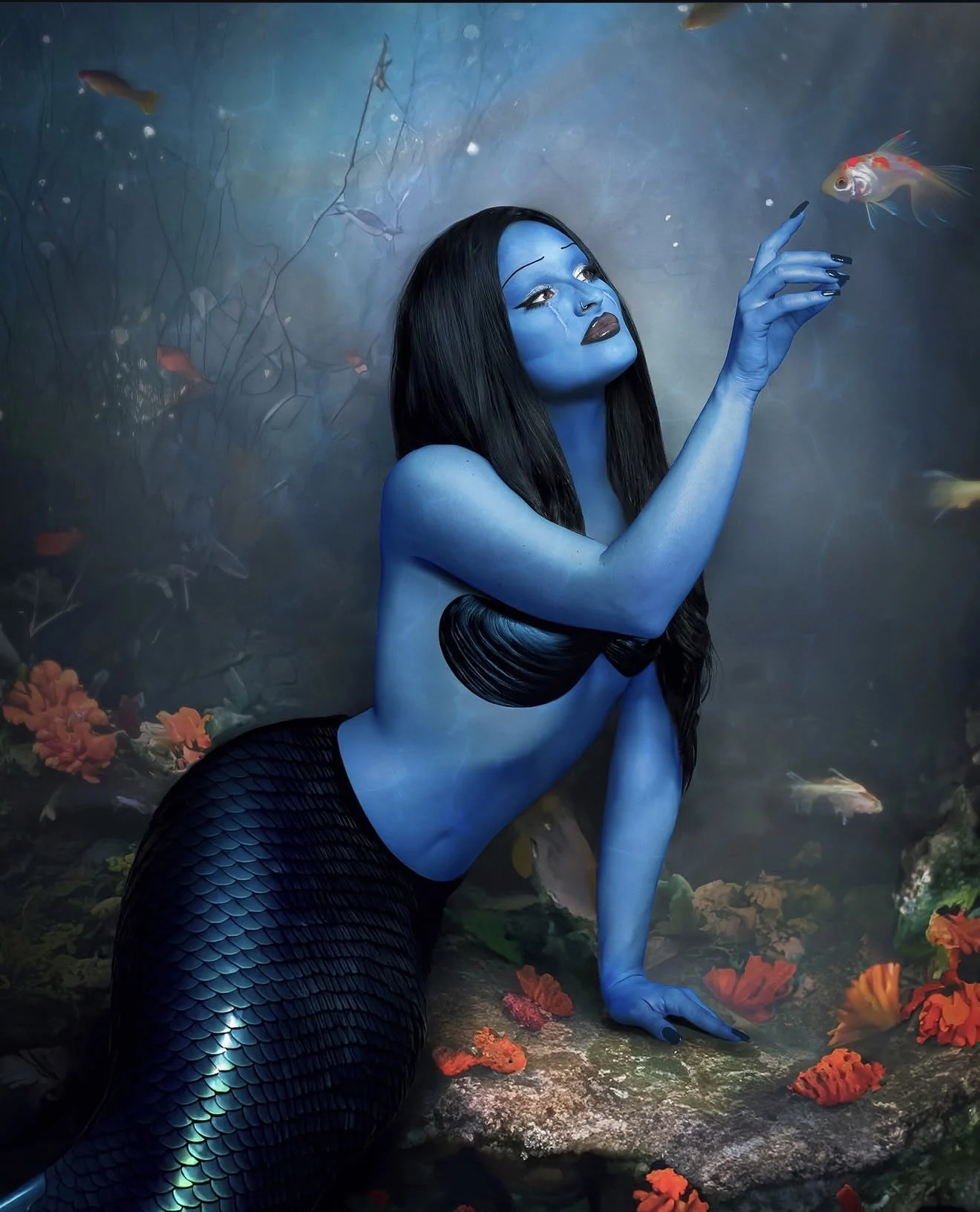
Imaginative image treatment
Consistent final delivery
04
Social media
Social media visual identity
Post & story templates
Content shoots for social media
Campaign visuals & retouching
Erjola BllacaIndependent creative practice
Start with a thought.
The starting pointThe brief. The first idea
A starting point, not the limit
Take it outside the box.
Let’s see where yours can go.
Tell me where the project begins: a name, an identity, a shoot or a final image.